
Why Accessible Signage Matters
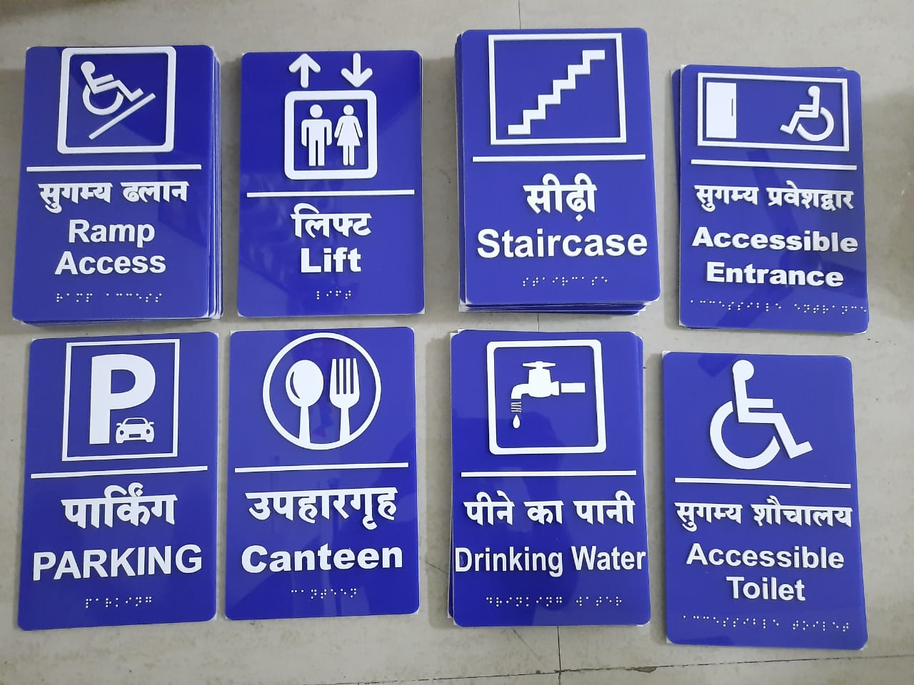
Visual signs assume everyone can see them. Tactile and braille signage removes that barrier and also helps in low light or smoke. For organisations, it signals inclusion and helps meet accessibility expectations for public-facing buildings.
Key Elements of an Accessible Sign
- Raised characters that can be read by touch
- Grade 1 braille placed consistently below the text
- High contrast between text and background
- Non-glare finish so signs are readable from different angles
- Simple pictograms for common facilities
Where to Use Braille Signs
- Restrooms and washrooms
- Lifts, stairs and emergency exits
- Meeting rooms, cabins and labs
- Hospital wards, classrooms and hotel rooms
- Reception and help desks
Placement and Mounting Tips
- Mount at a consistent height on the latch side of the door
- Keep the area in front of the sign clear
- Avoid placing signs on the door leaf if it swings open
- Use the same position throughout the building
Materials and Finishes
| Material | Look | Typical Use |
|---|---|---|
| Acrylic with tactile layer | Clean, modern, many colours | Offices, hospitals, schools |
| Metal (steel/brass) | Premium, durable | Corporate, hotels, public buildings |
| Photopolymer | Fine raised detail | Standard room signs |
Work with a signage maker who understands tactile specifications, and confirm requirements for your building type.


